Post Archive

Quick Tips for Developing Accessible Mobile Apps

Accessibility is critical to ensure that mobile apps reach the widest audience possible, and comply with accessibility laws and regulations.

Android and iOS development environments include accessibility features to help people with disabilities access and use apps. Common accessibility features include dynamic text and layouts, accessibility labels and hints, accessibility traits, and other features.

Here are some quick tips to make your apps more accessible for assistive technology users.

Use Accessible Color Schemes

Color contrast is critical for color-blind and low-vision users. Using accessible colors for text ensures that your content is readable for all users (including people with disabilities).

To ensure accessible color contrast:

  • Avoid placing text over background images
  • Avoid using color alone to convey information
  • Check lighter shades of text (i.e. grey text) to ensure sufficient contrast.

Web-Aim’s Color Contrast Checker is an excellent tool for testing color schemes for accessibility and WCAG conformance.

Apple and Android provide specific guidance for developers regarding accessible contrast and color schemes:

Provide Accessible Descriptions for Images and graphics

Image descriptions provide accessible information for AT users about the purpose and content of images. Both Android and iOS include methods for adding a description to an image.

In Android, you can include a description for an ImageView using the android:contentDescription attribute. Learn more about accessible images in Android

In iOS, you can provide an accessible description for images by setting isAccessibilityElement to true and adding an accessible label (accessibilityLabel). Learn more about accessible labels for images in iOS

Use Dynamic Text Sizes

Dynamic text allows users can increase text sizes using accessibility settings in iOS and Android. By using dynamic text in your layouts, you can ensure that your app works with larger fonts enabled in iOS and Android.

In Android, you can specify font sizes in scalable pixels (sp) to allow fonts to adjust to user preferences. For Android apps, we recommend testing your layouts with larger fonts enabled to ensure that they work well at all font sizes. Learn more about pixel densities in Android

In iOS, you can take advantage of dynamic type by using predefined text styles such as headline, body, and title1. You can configure text styles to adjust to user preferences in interface builder or directly in source code. Learn more about dynamic type in iOS.

Use Adaptive Layouts

Adaptive layouts ensure that your app is usable on the widest array of screen sizes and orientations. By providing an app that can work on both landscape and portrait formats, you can ensure that people with disabilities can access and use your app on tablets, phones, and other mobile devices.

In Android, you can create adaptive layouts by using flexible layout dimensions (dp), creating alternate layouts, and using nine-patch bitmaps for scalable graphics. Learn more about adaptive layouts in Android

iOS supports Auto Layout for designing adaptive interfaces. Auto layout automatically adjusts the layout and presentation of your app based on screen resolution, orientation, dynamic font size, and other factors. Learn more about adaptive layouts in iOS

Ensure Adequate Touch Target Sizes

Ensuring adequate touch target sizes is critical for users with motor and visual impairments. Target sizes should be large enough for users to easily activate and use touch controls. In the Web Content Accessibility Guidelines (WCAG 2.0), the minimum touch target size for priority AAA conformance is 44 x 44 CSS pixels.

For Android, Google recommends that touch targets should be at least 48dp by 48dp. Extra padding can be added to text links to meet this requirement. Learn more about touch target sizes in Android

In iOS, touch target sizes should be at least 44 by 44px to ensure that users can easily activate interactive components. Learn more about touch targets in iOS

Ensure that Controls Receive Focus in a Logical Order

Assistive technology devices such as Talkback and VoiceOver provide a visual focus indicator to help orient users. Managing focus is critical to ensuring accessibility for assistive technology users.

The focus order for your app should match the visual reading order to ensure accessibility for AT users. If the programmatic focus order of elements does not match the visual reading order, some users may have problems using your app.

For both Android and iOS, its important to test your apps with assistive technology to ensure that the focus order matches the visual reading order. In Android, you can override the focus order in your app using XML. Learn more about managing focus in Android

For iOS, focus order is determined by the physical layout of controls in your app. You can adjust the layout and reading order of elements by using the UIAccessibilityContainer element. Learn more about UIAccessibilityContainer for iOS

Provide a Unique Title for App Screens

Provide a unique title for all app screens using the app bar title. The app bar title helps orient users and should summarize the content or purpose of the screen.

In Android, you can use the default ActionBar or Toolbar to configure a unique title for your app bar. Learn more about the app bar in Android

In iOS, you can configure and customize the UINavigationBar to display a unique title for your app. Learn how to customize the app bar in iOS

Use Headings to Structure Your App Screens

Headings provide semantic information about the structure of your app content. Screen readers such as VoiceOver and Talkback also allow users to navigate using headings.

In Android, you can use the accessibilityHeading attribute to identify headings for accessibility services. Android also supports accessibility-friendly pane titles using the accessibilityPaneTitle attribute. Learn more about headings and titles in Android

In iOS, you can organize your content into sections using the UIAccessibilityTraits header property. Learn more about section headers in iOS

Provide an Accessible Label for Form Controls, Buttons and Other Interactive Components

Providing accessible labels for forms and buttons is critical to ensure that assistive technology users can access and use your app. Accessible labels describe the purpose of a control and should be clear and concise.

In Android, you can use the contentDescription attribute to add an accessible label for interactive components. Learn more about accessible labels in Android

In iOS, you can use the accessibilityLabel property to assign an accessible name for interface components. Learn more about accessible labels in iOS

More Tips

iOS includes UIAccessibilityTraits to help assistive technology users understand the purpose of controls. Use accessibility traits in iOS to provide additional semantic information for assistive technology (AT) users.

Conclusion

Android and iOS development environments include accessibility features to help you develop and deploy accessible apps. Here is a brief summary of techniques for accessible app development:

  • Use dynamic type and layouts
  • Provide accessible labels for forms, buttons and other interactive components
  • Markup lists, headings, and other components for accessibility
  • Ensure that all interactive components receive focus in a logical order

By making your apps accessible, you can reach the widest audience possible, avoid legal liability and comply with accessibility regulations.

If you have questions about accessibility or need help, please do not hesitate to contact us. Also, you can check out our mobile accessibility solutions page for more information.

Need Help Testing Your App for Accessibility?

Check out our mobile app accessibility solutions for more information.


COVID-19 Crisis Highlights the Need for Accessible Websites

In these uncertain times, it’s more important than ever for organizations and businesses to prioritize accessibility to ensure that people with disabilities have access to critical services and supports. While families endure lock-downs and businesses shutter, the current crisis provides a tremendous challenge and opportunity for businesses to improve the accessibility of online services for people with disabilities.

Healthcare

With doctors and hospitals prioritizing COVID patients, its essential that people with disabilities have full access to online healthcare services. This means providing systems that work seamlessly with assistive technology (AT) devices to allow people with disabilities to:

  • Order Prescriptions and Medications Online
  • Schedule online appointments with healthcare providers
  • Receive healthcare (including mental health counseling) online
  • Use accessible health monitoring and wellness technology

By providing online healthcare services in accessible formats, we can ensure that the most vulnerable members of society have access to critical supports and services.

For Healthcare providers, we offer accessibility audits and certification services to ensure that website and apps are fully accessible for assistive technology users.

Food Services

As restaurants have closed their doors to customers, many are providing online delivery or curbside pickup for customers. For online orders, its critical that websites and apps work well for assistive technology users. Accessibility barriers may prevent AT users from placing orders and receiving deliveries of essential food supplies including:

  • Online grocery orders and deliveries
  • Restaurant take-out and delivery orders

Without access to accessible online services, the most vulnerable members of our society may be forced to visit stores and restaurants in person to get essential items.

We work with restaurants and grocers to ensure that their websites and apps are accessible for people with disabilities. Contact us for a free consultation or request a quote for services.

Entertainment and Well-Being

As people with disabilities seek to avoid exposure to COVID-19, more people are looking at online options for entertainment, exercise, and other activities. It is essential that people with disabilities have access to services that promote well-being in the home including:

  • Virtual yoga and exercise
  • Online streaming services
  • Video and other online communication
  • And more

Aurora provides consulting services for businesses that offer wellness supports and services throughout the community. Please contact us for a free consultation or request a quote for services.

Conclusion

We are in uncertain times with COVID-19. The lack of clarity regarding the duration and scope of lock downs has caused tremendous uncertainty for people with disabilities and the community at large.

To ensure that people with disabilities can receive essential services, and that businesses reach the widest audience possible, we should redouble our efforts to provide accessible online services for people with disabilities.

We are ALL in this together!

Need help with accessibility?

Get industry-leading support to achieve your compliance goals!


Quick Tips for Publishing Accessible Content in WordPress

WordPress is an excellent platform for publishing accessible content on the Web. Using an accessibility-ready theme and the WYSIWYG editor, anyone can begin publishing accessible content using WordPress CMS.

This article will highlight techniques for publishing accessible content in WordPress using the Classic WYSIWYG editor (Classic Editor plugin). Many of the options described below are available in the Gutenberg editor, but we prefer the classic WordPress editor, as it gives you the greatest control over content formatting.

Use Headings to Structure your Pages

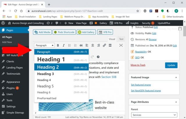
Screenshot of WordPress WYSIWYG editor with paragraph formats

Headings are an excellent way to provide structure for your pages and are required for WCAG compliance (WCAG SC 2.4.6 – https://www.w3.org/TR/UNDERSTANDING-WCAG20/navigation-mechanisms-descriptive.html). Using the classic WYSIWYG editor, select the drop-down labeled “paragraph” and choose a heading level. Also, ensure that headings are nested correctly in your post content. Heading 2 should be used for subheadings of Heading 1, heading 3 for subheadings of Heading 2 and so on.

Use the Bullet and Numbered Lists Options to Format Lists

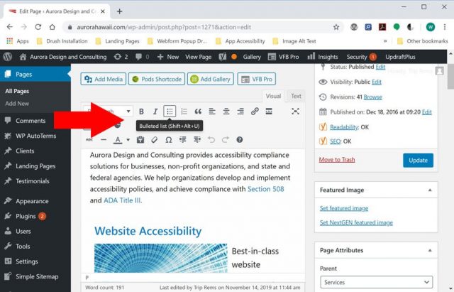
Screenshot of WordPress WYSIWYG editor with bullet list option highlighted

The WordPress WYSIWYG editor includes options to format paragraphs as Bullet or Numbered Lists. Using these options ensures that your lists include correct HTML markup for ordered (OL) and unordered lists (UL). Using correct formatting for lists is important for assistive technology users, and is a requirement for WCAG conformance (SC 1.3.1 – https://www.w3.org/WAI/WCAG21/Understanding/info-and-relationships.html).

Use Blockquotes for Quotations

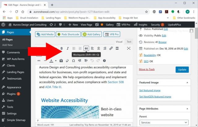
Screenshot of WordPress WYSIWYG editor with blockquote button highlighted

Blockquotes are used to markup quotations in HTML. The WordPress classic editor includes an option to easily format quotations using the HTML blockquote element. Using this element ensures that information about quotes or citations is presented to assistive technology users.

Use Correct Encodings for HTML Symbols

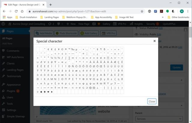
Screenshot of WordPress WYSIWYG editor with symbol library

Using correct encodings for symbols is essential to ensure that your pages are parsed correctly by assistive technology devices. The classic editor in WordPress includes a symbol library which allows you to easily format symbols such as quotation marks, EM and EN dashes, and other symbols using the correct HTML encoding.

Use Descriptive Link Text

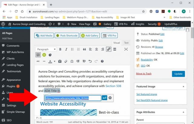
Screenshot of WordPress dashboard with link text highlighted

Ensure that link text in your posts and pages makes sense when read out-of-context. Avoid using ambiguous link text such as: Click Here, Learn more, etc. You can easily add links to your posts and pages by highlighting text in your page and selecting the “Link” icon in the WYSIWYG Editor (under the Visual tab).

Add Alternate Text for Images in the Media Library

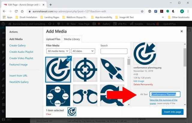
Screenshot of WordPress media library with alternate text field highlighted

Alternate text descriptions provide assistive technology users with information about the content and context of images on the Web. WordPress includes options to allow users to add alternate text, captions, and descriptions for images uploaded to the Media Library. Adding alternate text for all images that convey information (non-decorative) is essential for accessibility and WCAG conformance (SC 1.1.1 – https://www.w3.org/TR/UNDERSTANDING-WCAG20/text-equiv-all.html ).

Conclusion

The WYSIWYG editor in WordPress includes all of the features required to begin publishing accessible content in WordPress. By using an accessibility-ready theme, and good publishing practices, you can publish content that is fully accessible for assistive technology users, and reach a wider audience.

Need Help?

Aurora provides training and support for publishing accessible content in WordPress. Check out our training solutions, and contact us for more information.


Orderspoon Takes the Lead in Digital Accessibility

Orderspoon (by 4 Leaf Labs), an online order app for restaurants, has set a new standard for accessibility in the online order space. The customizable Orderspoon app integrates with Clover POS, and has been updated to ensure compatibility with assistive technology devices (including screen readers and braille displays).

Accessibility Features of the Orderspoon App

The Orderspoon app works seamlessly with assistive technology devices, and conforms with the World Wide Web Consortium’s Web Content Accessibility Guidelines.

Here are a few notable accessibility features of the app:

  • Keyboard accessibility – all forms, controls, menus, etc. are usable with a keyboard only.
  • Enhanced Readability – the Orderspoon app meets minimum required contrast levels for WCAG 2.0 priority AA compliance (4.5:1)
  • Ease of Navigation – the Orderspoon app includes consistent navigation systems, skip links, and ARIA landmark roles to improve usability and accessibility.
  • Mobile Compatibility– the Orderspoon app is fully responsive, and text can be resized as needed using browser zoom (up to 200%).

Background

In April 2019, Aurora Design and Consulting was commissioned to help the 4 Leaf Labs’ development team update Orderspoon for accessibility with assistive technology devices. During a three-month period, Aurora staff provided accessibility training, email/phone support, and accessibility testing services to update the Orderspoon app for accessibility with assistive technology devices.

As work was completed on the Orderspoon app, we provided accessibility evaluation services (including testing with VoiceOver and NVDA screen readers) to verify and document accessibility conformance with WCAG 2.0 priority AA. For accessibility documentation, we provided a Voluntary Product Accessibility Template (VPAT), accessibility information page, and conformance letter.

Visit the Orderspoon website to learn how Orderspoon can help you reach more customers, meet accessibility requirements for assistive technology users, and expand your business.

Need Help Updating Your App for Accessibility?

Contact us for a free consultation, or request a quote for services.


Supreme Court declines to hear case against Domino’s Pizza

The US Supreme Court has denied a petition by Domino’s pizza to rule on a lower court’s decision that it is liable for the inaccessibility of its website. In doing so, the Supreme Court upheld the Ninth Circuit court’s decision that the lawsuit does not violate Domino’s right to due process.

The original suit was filed by Plaintiff Guillermo Robles—a blind man who claimed that he was not able to order pizza using Domino’s website or mobile app.

This landmark case allows the original suit to move forward, and could pave the way for similar accessibility lawsuits under ADA Title III.


National Law Review Publishes Article on Website Accessibility Litigation

National Law Review – August 2, 2019

The National Law Review has published a new article on the growing risk of accessibility litigation. The article covers current legal trends, and some tips to avoid a costly ADA Title III lawsuit.


Why Manual Testing is Critical for Accessibility Compliance

Despite an increasing number of automated tools to evaluate websites for accessibility, manual accessibility testing is more important than ever for evaluating real world accessibility of websites. This is because many accessibility barriers can escape detection with automated accessibility scanners. Also, testing with assistive technology devices is the best way to get a real-world picture of accessibility, and to determine compatibility with common assistive technology devices including screen readers, braille displays, screen magnifiers, and other AT software/devices.

Also, manual tools can be used to:

  • Evaluate the extent and impact of WCAG failures on website accessibility
  • Identify accessibility improvements needed to ensure the best experience for assistive technology users
  • Complete a conformance evaluation and make a conformance claim (aligns with W3C recommendations for evaluating websites for accessibility).

Strengths of Automated Accessibility Scanners

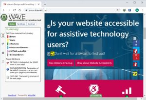
Screenshot of Wave Accessibility Tool for Google Chrome

Automated tools are great for getting a mile-high view of website accessibility. They are also excellent tools for identifying programmatic errors that might impact accessibility such as missing alternate text, duplicate element IDs, empty buttons and links, and other errors. Premium automated tools (i.e. Siteimprove) also have the benefit of scanning larger selections of pages than might be impractical to test manually using assistive technology devices.

Here is a list of some free tools to identify HTML/CSS errors and WCAG 2.0 failures:

Also, there are many premium tools to evaluate website accessibility conformance and to document WCAG failures. Siteimprove, SortSite and Compliance Sheriff allow users to scan a much larger selection of pages to identify WCAG failures.

Strengths of Manual Accessibility Testing

Photo: Blind person using a Braille display

Manual testing involves testing websites with assistive technology devices to evaluate compatibility and identify any accessibility barriers. Manual accessibility testing is the best way to get a real-world picture of accessibility compliance, and to identify significant barriers for assistive technology users.

There is no replacement for real-world testing for accessibility compliance, and manual testing can identify many errors that automated tools might miss including:

Keyboard Accessibility problems – missing keyboard focus, forms and menus that do not work with a keyboard only, inaccessible dialogs, and other accessibility errors.

Contrast Errors – Automated tools are an excellent tool to identify potential contrast problems, but they have some inherent limitations. Automated tools like Wave’s contrast tool do not account for background images, text styling, and other effects that might impact the readability of text.

Error Reporting – problems with form field validation and error reporting can only be evaluated properly using assistive technology devices.

Here are some great free tools that we use for manual accessibility testing and evaluation:

To effectively evaluate website accessibility with assistive technology devices, the W3C also recommends employing both expert AT users and people with disabilities to get a complete picture of accessibility.

Conclusion

Evaluating websites for accessibility requires both manual and automated testing to get a complete picture of accessibility.

Automated tools are an excellent choice for identifying programmatic errors that might impact accessibility, while manual testing is essential to evaluate compatibility of websites with assistive technology devices. Together, manual and automated testing can be used to evaluate website accessibility, and to verify and document accessibility compliance with the W3Cs Web Content Accessibility Guidelines.

Need help with your Website?

Check out our industry-leading audit and evaluation services, or contact us for a free consultation or quote.


Accessibility of 2020 Presidential Candidates’ Websites

A recent article in Time highlights the inaccessibility of campaign websites for the 2020 presidential election candidates. Staff at the Miami Lighthouse for the Blind tested campaign websites for compatibility with assistive technology devices, and found that none of the websites were fully compliant with the Americans With Disabilities Act.


Domino’s Petitions the US Supreme Court to Review Website Accessibility Decision

Domino’s corporation has petitioned the US Supreme Court to review the Ninth Circuit Court’s decision that allowed an accessibility lawsuit against it to proceed. The lawsuit was filed by Guillermo Robles in September 2016.

Mr. Robles contends that he was not able to order a custom pizza online using Dominoes website and mobile app.


Aurora Design and Consulting featured on Inside the ADA

Aurora Design and Consulting was featured on “Inside the ADA” on LA Talk radio on June 5th, 2019. President and CEO, Trip Rems, joined the hosts of Inside the ADA to discuss the state of ADA Title III and website accessibility.

Topics included:

  • Introduction to website accessibility
  • Overview of ADA Title III and the WCAG 2.0
  • Legal trends in website accessibility

 
Request a Quote