Microsoft PowerPoint is an excellent choice for publishing accessible presentations for all audiences (including people with disabilities). As with most Microsoft products, its important to use the latest version of PowerPoint (i.e. Office 2021 or Office 365) to ensure that you are getting all of the latest accessibility features including:
- Accessible templates/themes for your presentations.
- Built-in accessibility checker to quickly identify accessibility errors.
- Tools and resources for publishing accessible presentations.
Here are some quick tips to help you get started with accessible publishing in PowerPoint
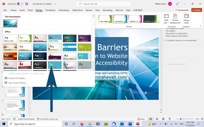
Use PowerPoint Themes to Format your Presentation
PowerPoint includes bundled themes which are pre-formatted for accessibility. Slide design templates include basic formatting for accessibility including: headings, list formatting, etc. You can access PowerPoint themes by selecting the Design tab in PowerPoint and choosing “More” under the Themes panel.
Important Note about Themes – When choosing a theme, some color combinations may not be fully accessible for people with low vision. We recommend selecting a theme with good color contrast (text) or updating theme colors to ensure accessibility for low vision users.
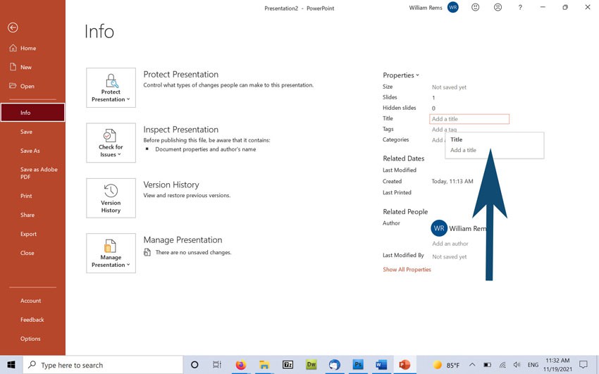
Title Your Presentation
Titling your presentation ensures that AT users will hear a description when opening your presentation. You can give your presentation a title by selecting File → File Info in PowerPoint, and adding your title under “File Properties”.
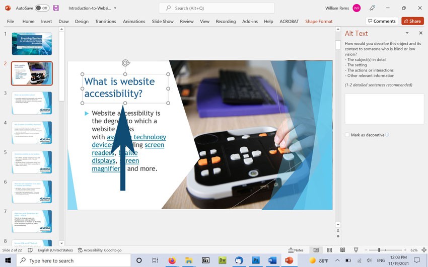
Title Each Slide in Your Presentation
PowerPoint themes include a title box for your slide title. Be sure to enter a title for each slide in your presentation.
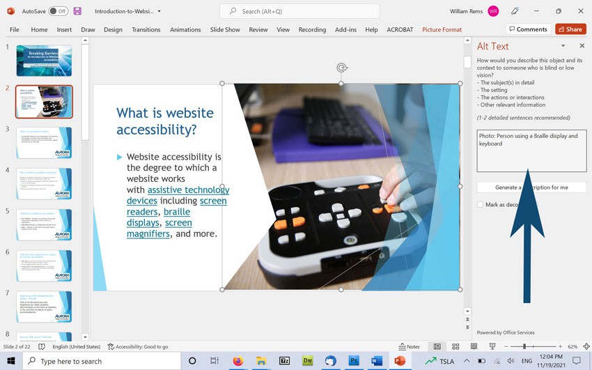
Add Alternate Text Descriptions for Images
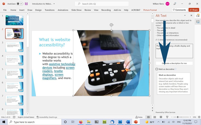
Alternate text descriptions are read in place of images by screen readers and other assistive technology devices. All images that convey information in your presentation should include alternate text descriptions. You can add alternate text to images in your presentation, by right clicking on the image, and selecting “Edit Alt Text”.
Identify Decorative Images
Use the “Mark as Decorative” option in the Alt Text pane to identify images that should be ignored by assistive technology devices.
Add a Header Row for Data Tables
Tables can be a challenge for AT users to navigate and understand. We recommend using tables only for displaying tabular data and avoiding table layouts for visual formatting.
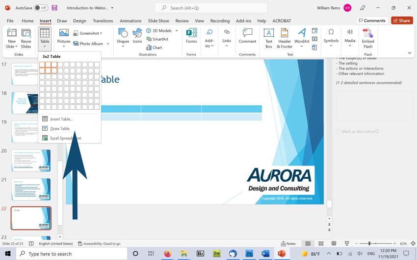
To add a data table in PowerPoint, select Insert a Table, and select the number of rows and columns to add.
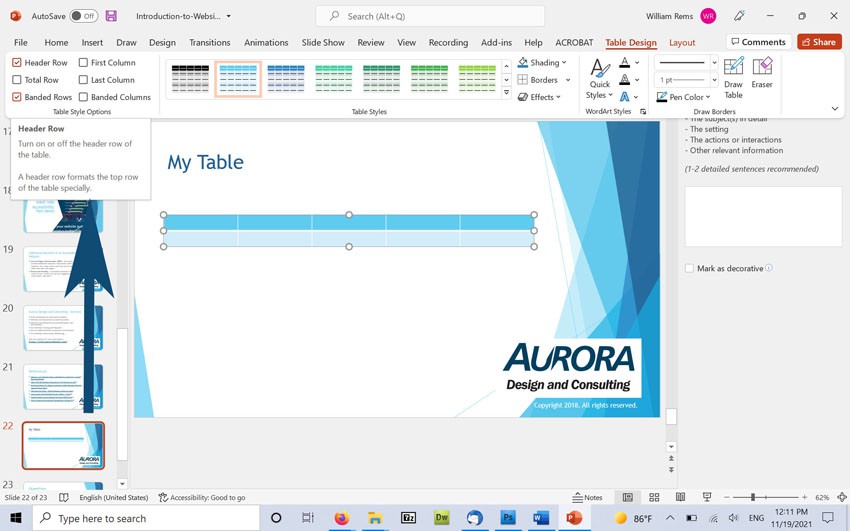
Once you have added your table, select the table and choose “Table Design” from the main menu. In the Table Design panel, ensure that the “Header Row” option is selected.
Use Bullet and Numbered Paragraph Styles for Lists
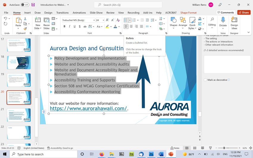
Bullet and numbered list styles are included in the paragraph panel in PowerPoint. You can add a new list by selecting a text box and choosing the Bullet or Numbered list option in PowerPoint (under the home tab).
Use the Built-In Accessibility Checker in PowerPoint
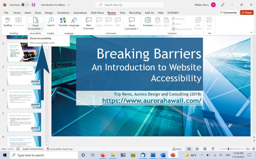
PowerPoint includes a built-in accessibility checker to help you quickly identify and resolve accessibility errors in your presentation. You can run the accessibility checker while editing your document by selecting Review → Check Accessibility in PowerPoint.
Verify the Order of Elements in Your Slides Using the Selection Pane
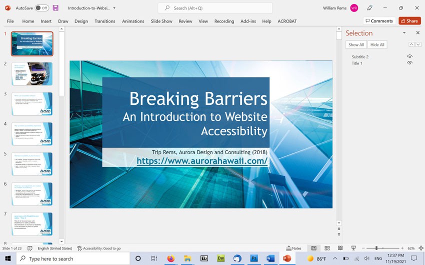
The selection pane allows you to arrange the order of elements in your slides to match the visual reading order. You can access the selection pane by selecting the “Home” tab and choosing “Selection pane” under “Arrange”.
Please Note: the order of elements in the selection page is reversed—so items at the bottom of the selection pane will be read first.
More Tips for Accessibility
- Ensure adequate contrast for slide text. You can check accessible color combinations by using Web-AIMs Color Contrast Checker.
- Avoid inserting video and audio content directly in PowerPoint files. Instead, provide a link to videos with captions and/or audio description in YouTube, Vimeo or other video hosting platform.
- Ensure that text is sufficiently large for low vision users. Generally, 24pt is a good starting point for visual presentations.
- Avoid using slide transitions or animation–as these might confuse AT users.
- If you intend to distribute your presentation online, be sure to covert your file to tagged PDF format (using the latest version of Adobe Acrobat Professional).
Need Help?
Aurora provides training and direct support to help you reach your accessibility compliance goals. Contact us today for a free consultation, or request a quote for training and professional development solutions.

